Rebranding, Communication Design
Day of the Dead Festival
Size ·························· 20x30” poster, 16x11” leaflet
Medium ··················· Print
Tool ························· InDesign, Photoshop, Illustrator, Spark AR
Duration ·················· Oct–Nov 2020
Project Summary
This project objective is to develop a visual identity of a multi-lingual cultural festival that strongly reflect the traditional Mexican’s cultures and attract the appropriate target audience analyzed within the research of the festival. The design challenges was to create a unity design system works across multiple mediums. The project includes a large-scale poster, etickets, and a fold out program detail.
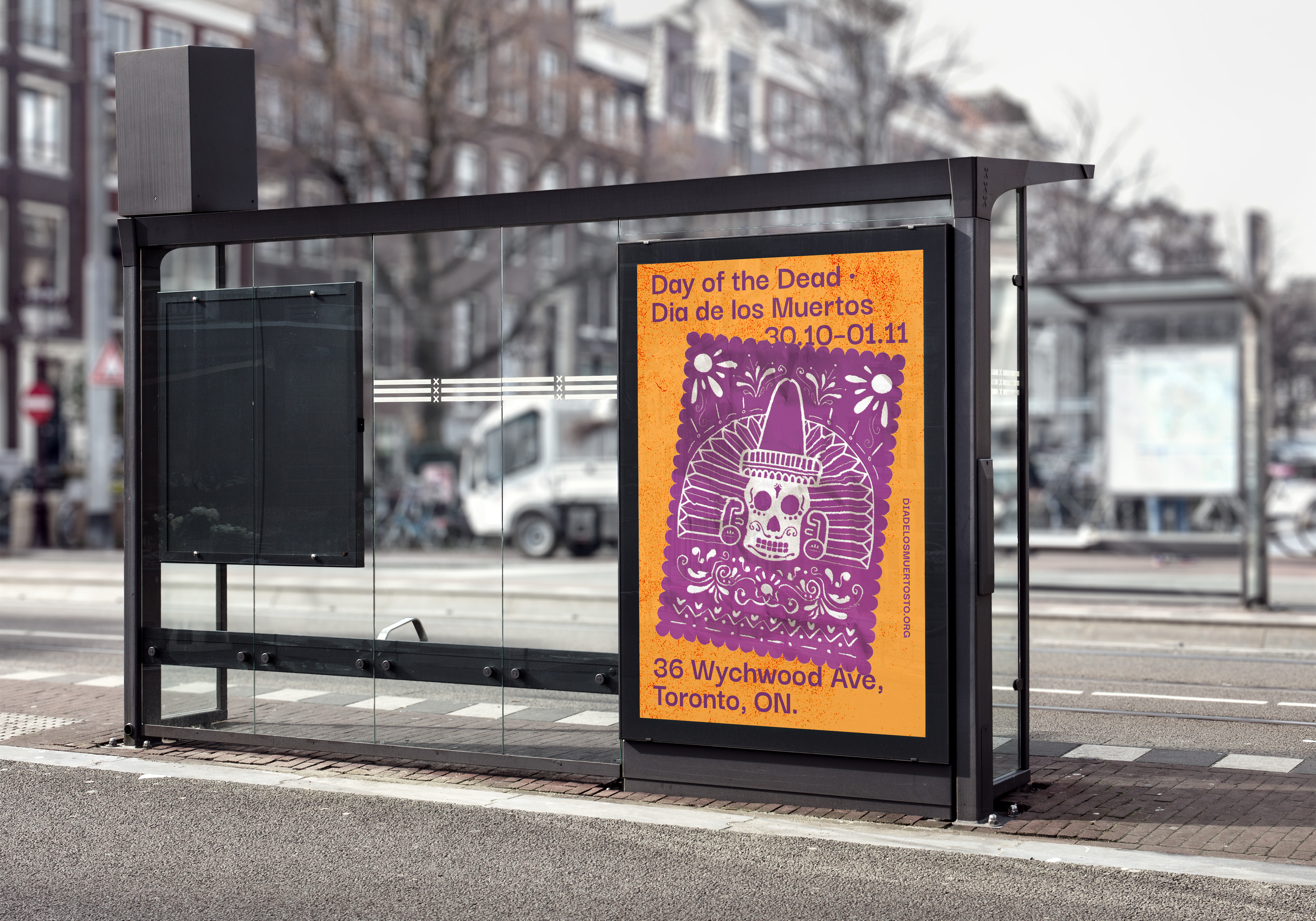
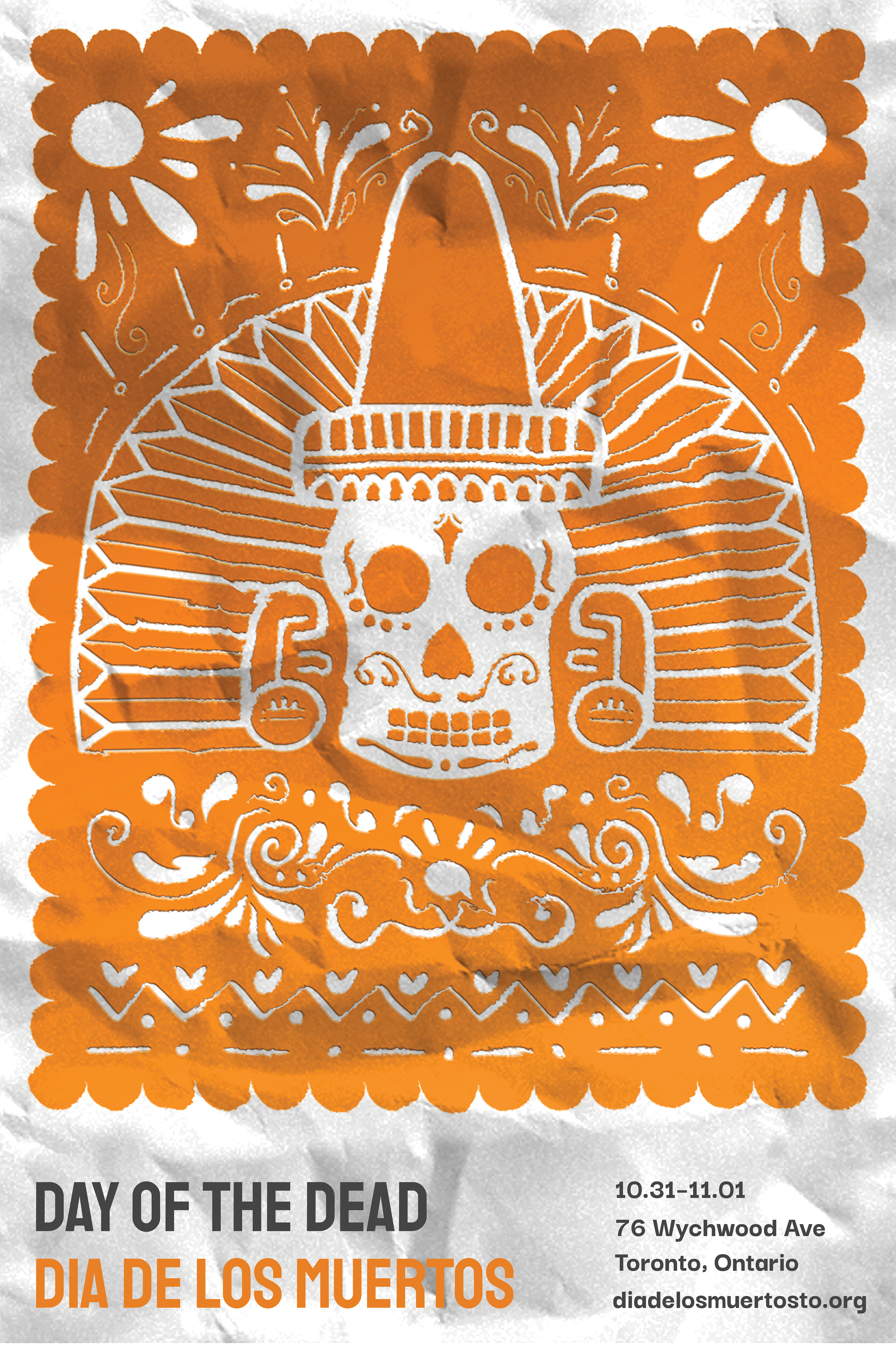
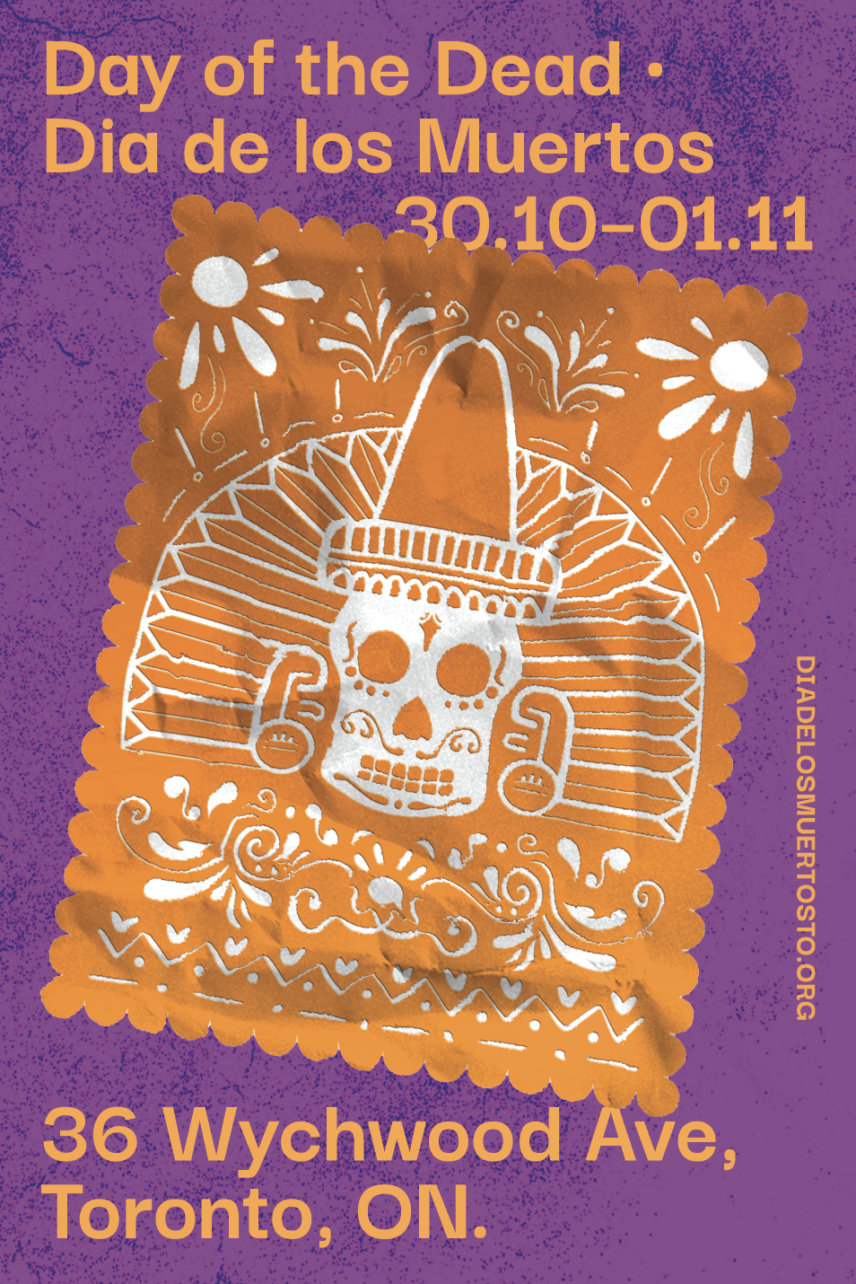
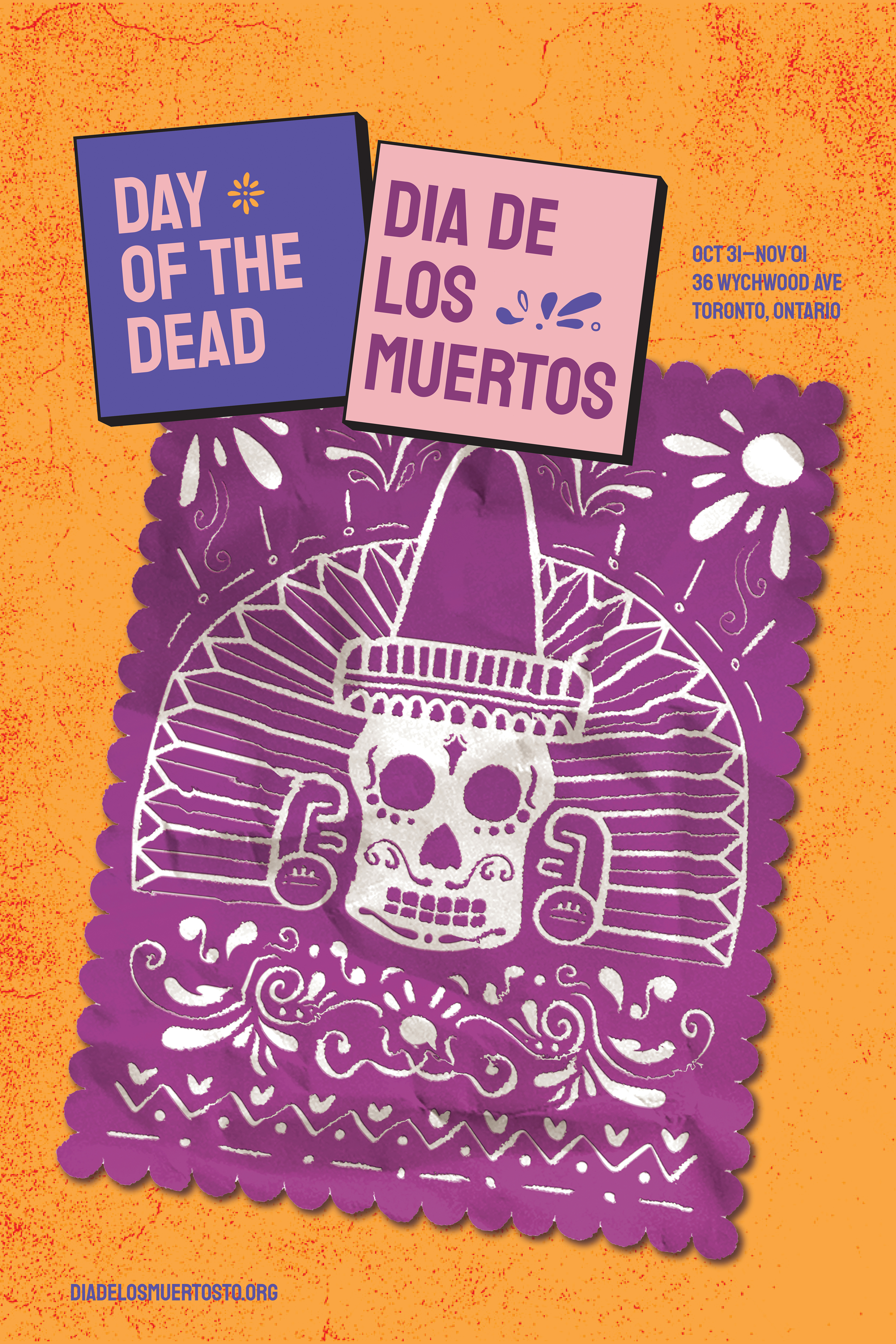
The Posters
I used the image of the Papel Picado, a type of paper decoration used during the festival, as the focal point of the poster. The colour scheme is vibrant and bold with the two main colours representing the festival. The yellow-orange colour represents the Marigold flower, which is a mainstay flower for the Day of the Dead altars. The colour purple signifies grief and mourning.

The E-tickets
The e-ticket adapts motifs from the poster as well as bold colours to highlight the personality of the festival. Two colours are used to differentiate the languages.

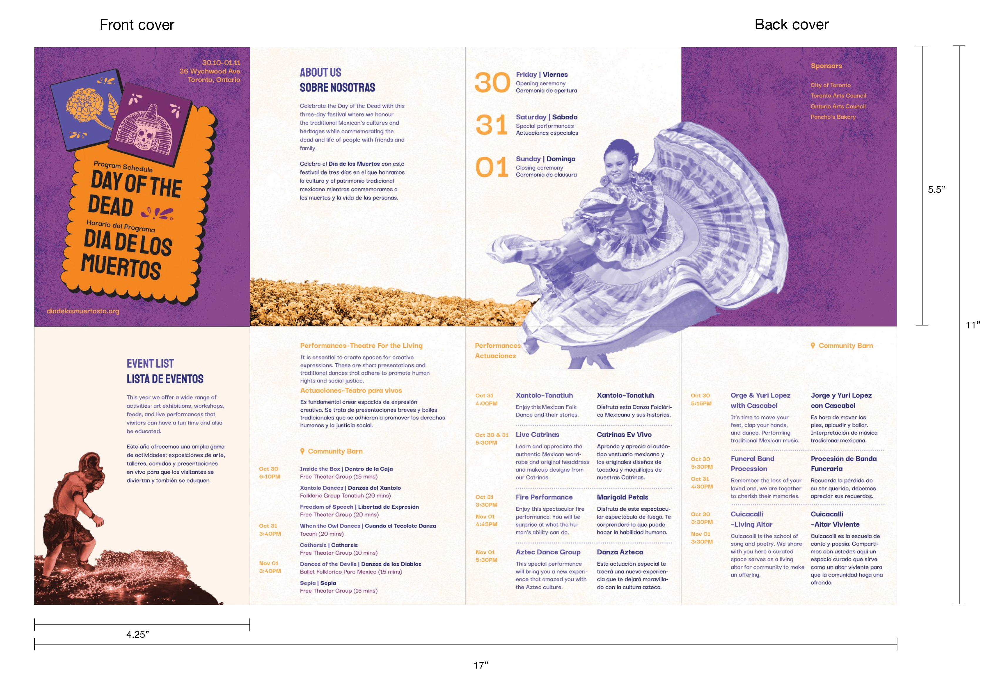
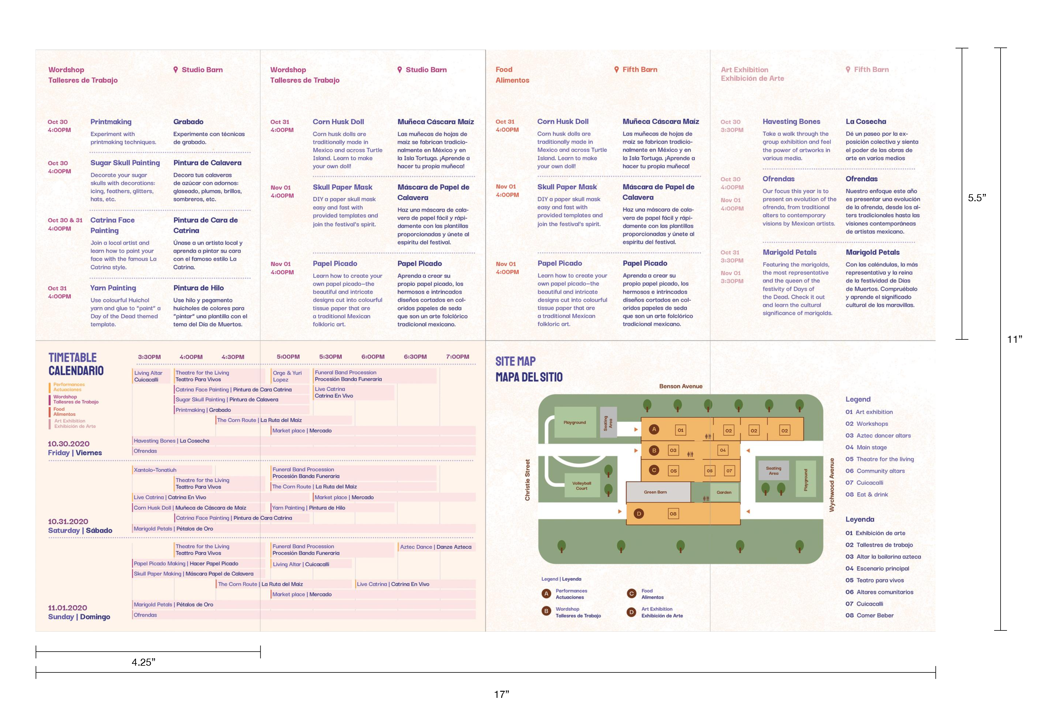
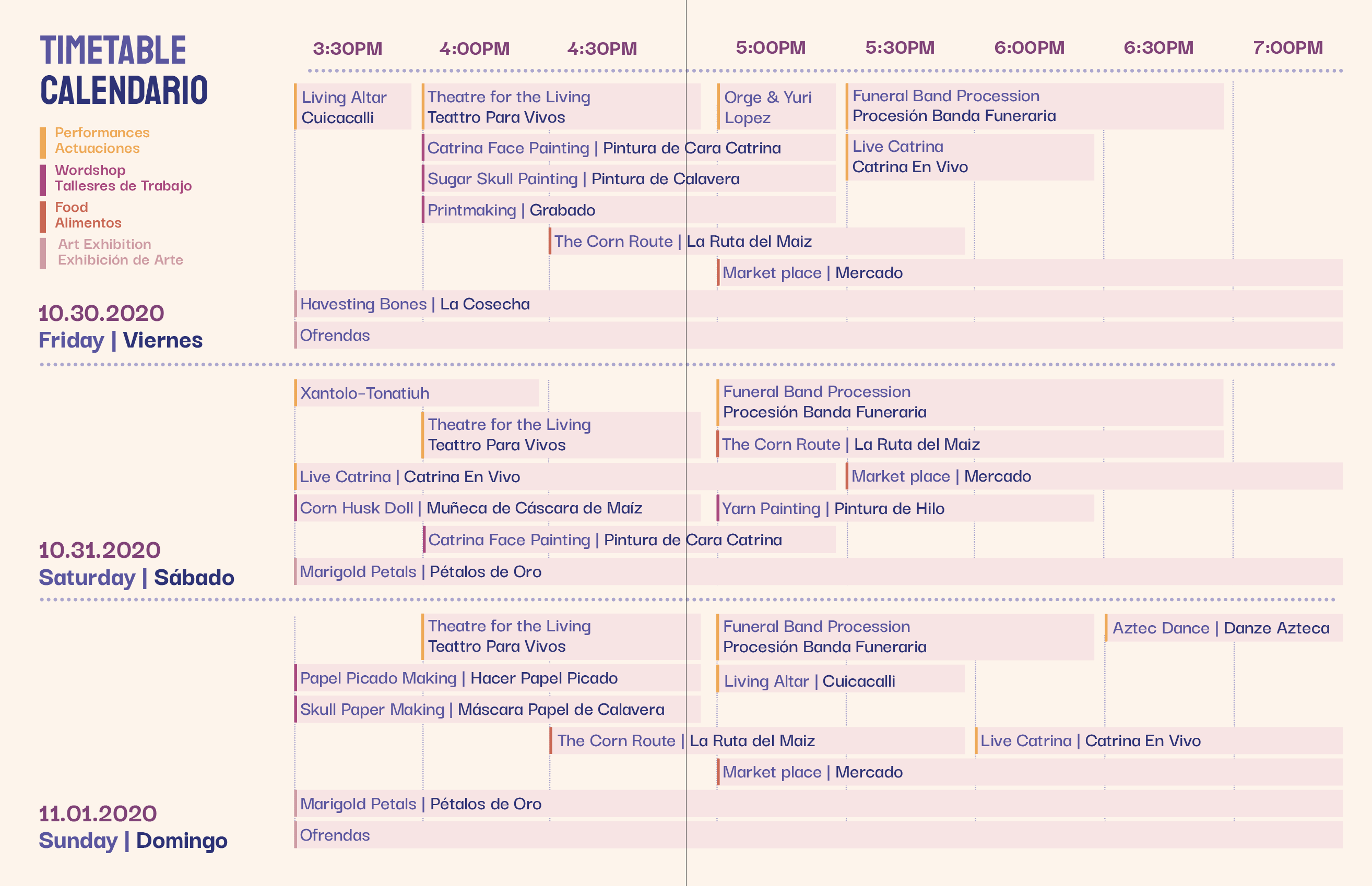
The Program Leaflet
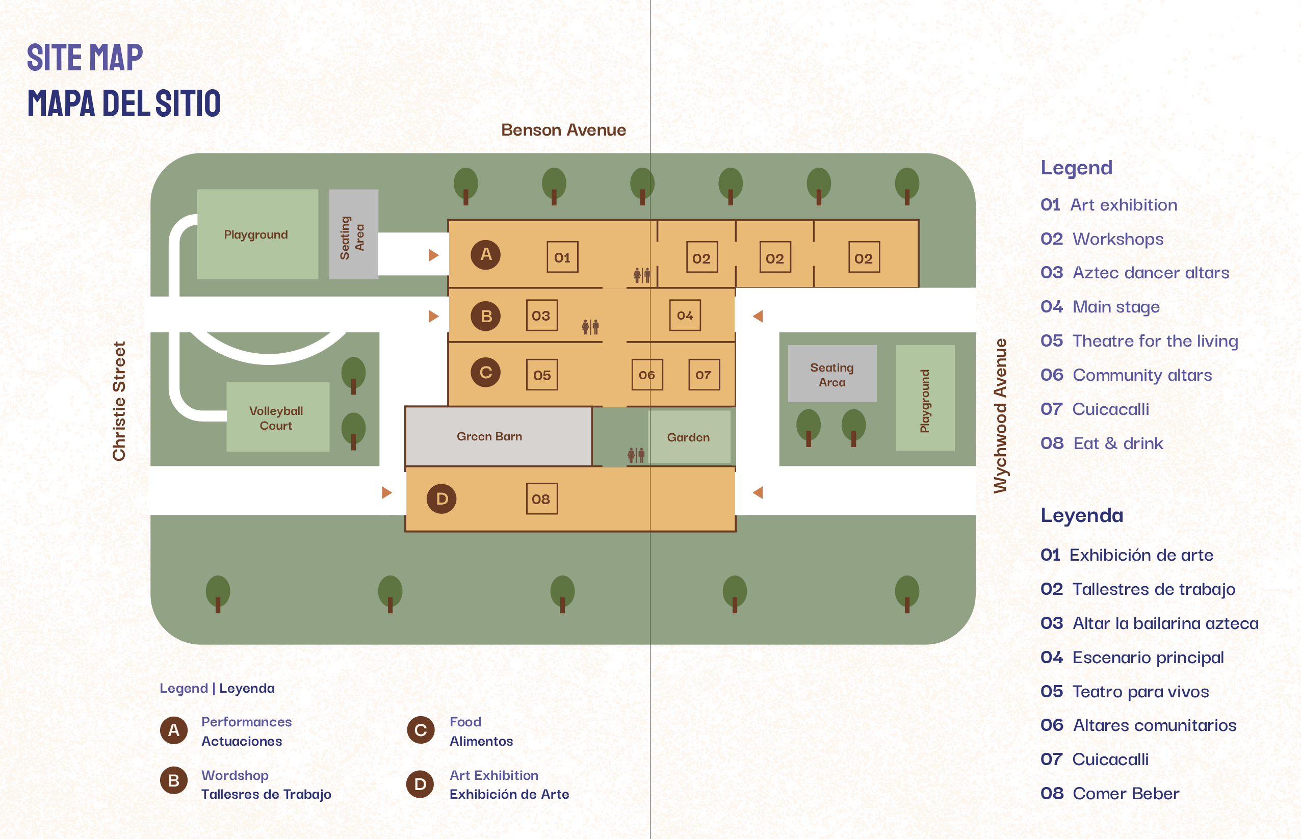
This bilingual program leaflet is a half z-fold include detailed event descriptions, a timetable of the activities in the 3-day span of the festival and a site map. This information is organized by type of activities, art exhibiotion, interdisciplinary performances, wordshops and eats & drink. Each section is colour coded to create organization and unity thoroughout the leaflet.


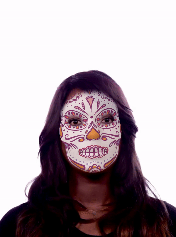
Face Filter
To extend the deliverables further, a filter was created to showcase the festivity of the Day of the Dead Festival. The illustration is drawn based on the Face Reference Assets from Spark AR.